Iron Island is a fitness lifestyle brand based in Long Beach, California. Owned by a proud Filipino American, the logo honors those roots and is an ode to the gritty, old-school Gold’s Gym bodybuilders a-la Arnold Schwarzenegger that paved the way for future fitness enthusiasts.
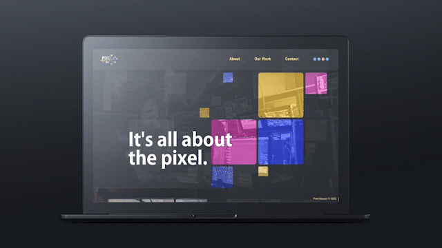
Website designed to showcase the work of Pixel Mosaic
Mobile and web app designed to offer organizations a convenient central hub to coordinate their events
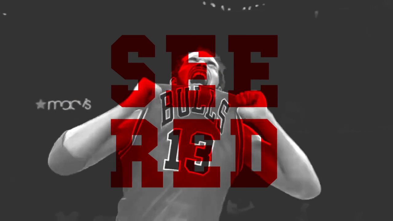
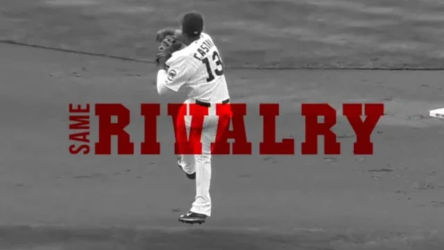
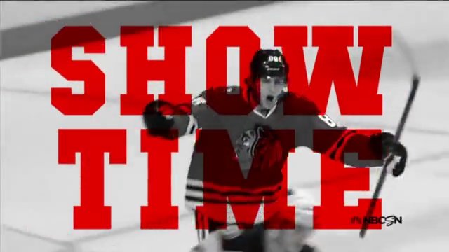
Three different commercial spots for a ficitious Chicago's sport's network - The Home Advantage. Each video highlights a specific, beloved Chicago team highlighting plays and players and using dialogue specific to each sport as support.
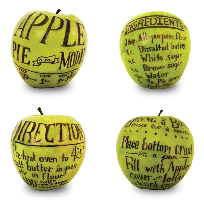
This apple pie recipe is written out on it's main ingredient-apples. The goal was to design a recipe page using expressive typography. It helps to illustrate the idea while also being a useful poster you can hang on the kitchen wall. Created using an ink pen on apples.
Inspired by Chicago’s motto, “Urbs in Horto” which translates to “City in a Garden, this floral-like logo for the city of Chicago encapsulates the organic shapes of nature while also reflecting the structural design of the city’s famous architecture in one design. The banner designs also incorporate organic shapes that embody the many green spaces in the city as well as the waters of Lake Michigan while highlighting some of Chicago’s best known landmarks that make it appealing to residents and tourists, even tourists in their own city.
It can be said that, unofficially, Chicago already has a logo in their flag with the 4 red stars and 2 blue bands that any Chicagoan recognizes. So here, incorporating those colors, the branding can fit right along with the flag.
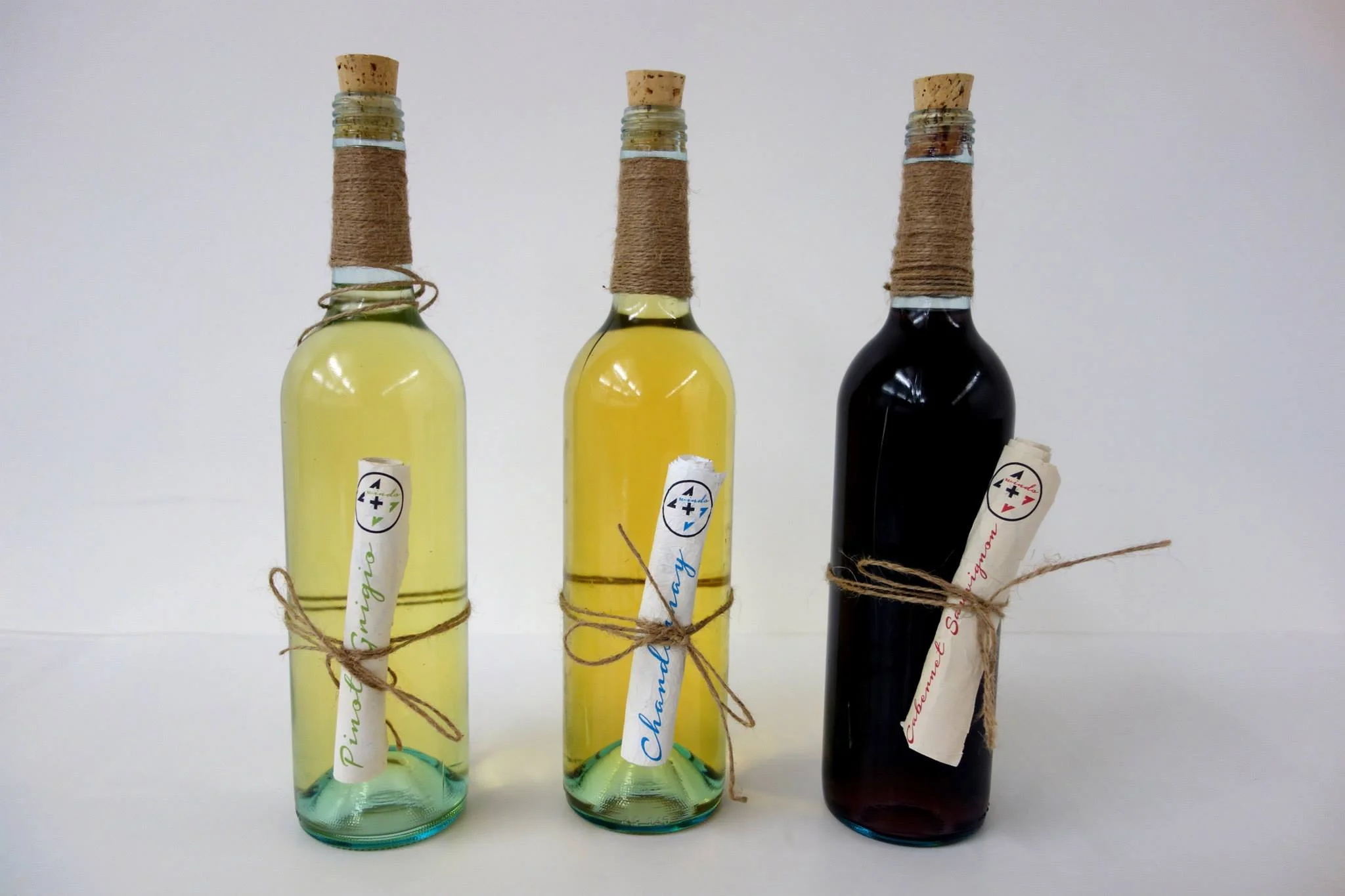
The logo for 4 Winds Winery incorporates the number 4 into a compass that plays off of the name of the winery referring to all different directions.
Paying homage to the “message-in-a-bottle”, the packaging for 4 Winds Winery bottles are non-traditional allowing the consumer to interact with the label. Each label unravels a new message and reveals a fact of the history of this method of communication.
This is a fictitious movie poster. The name of the movie was a given title, but the project consisted of creating a movie plot and its corresponding teaser poster using typography only. One Hundred Years of Solitude was my given movie title. It is a movie about the Genie's life inside of his lamp before Aladdin set him free.
The Monster's Inc. logo comes to life
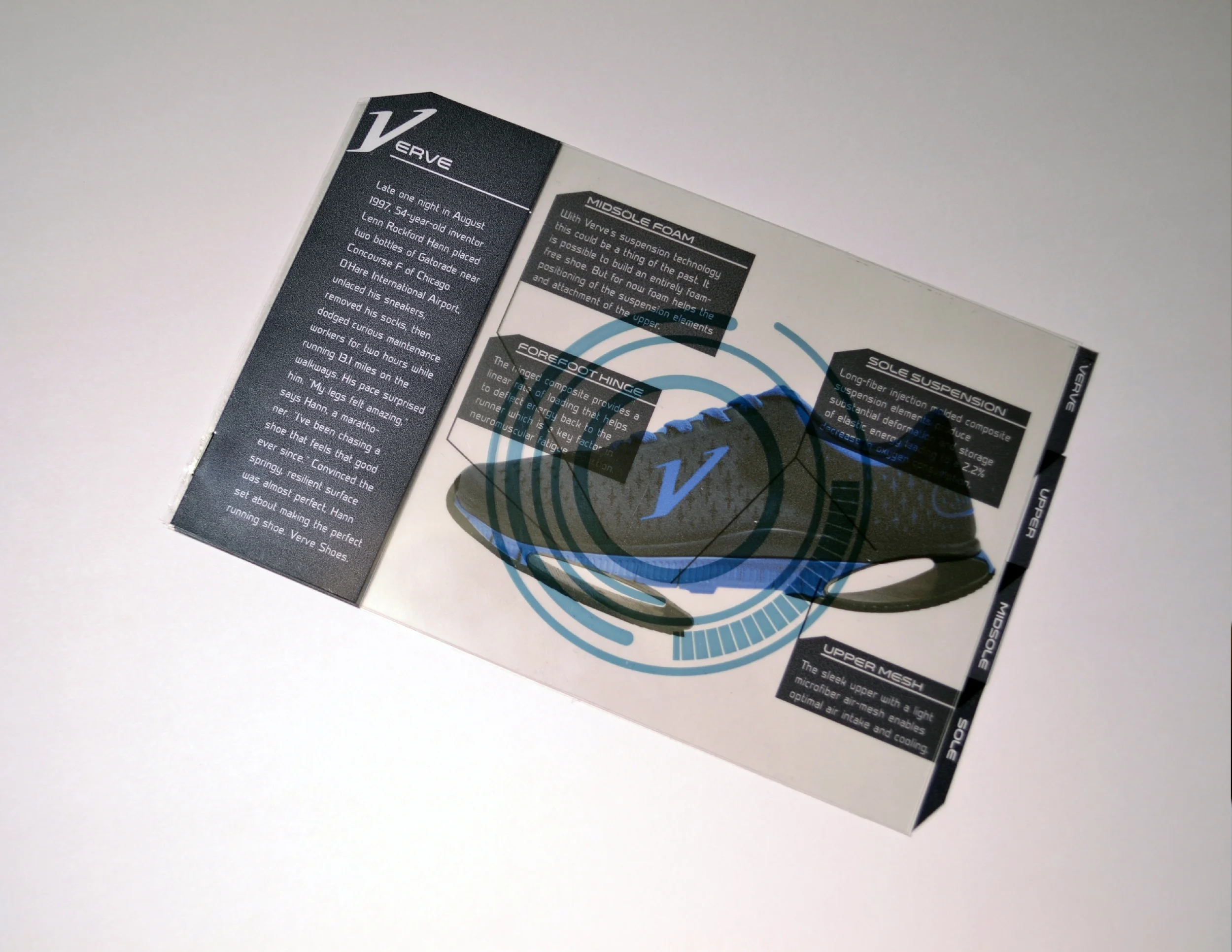
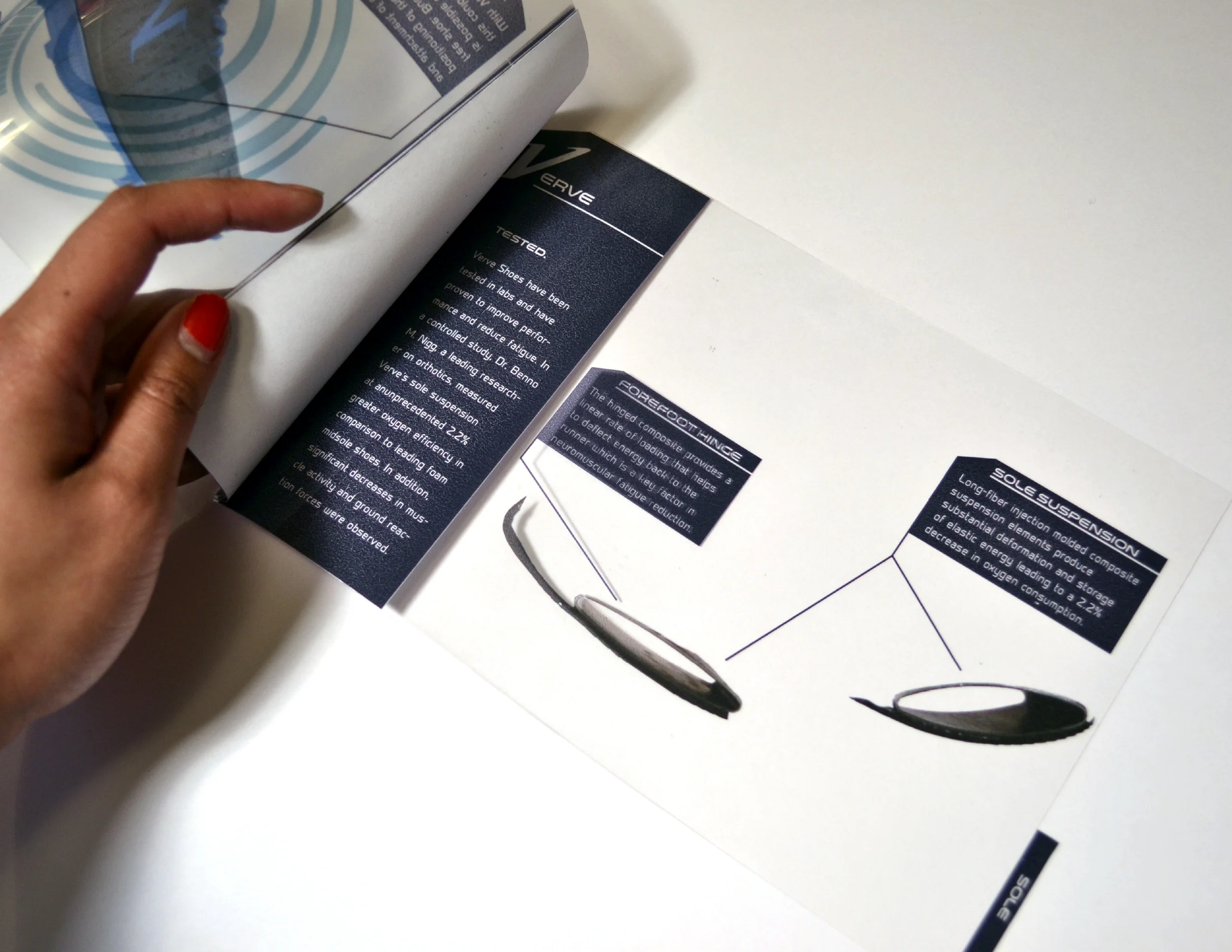
An idea born of O’hare airport, Verve Shoes* is a new innovative shoe that utilizes proprietary technology that has been proven to improve the way we run.
Promotional and packaging design breaks down and highlights the new technology built into each shoe that are meant to change the future of running.
*Just a prototype
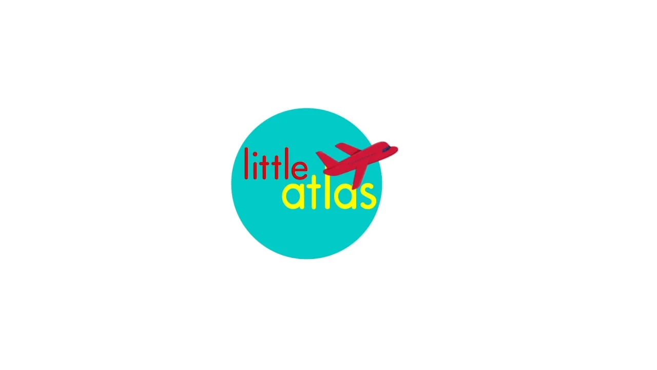
LittleAtlas: The Philippines is one animation in a series of educational and entertaining videos geared towards teaching kids about the beautiful diverse world we live in by teaching them what makes us all wonderfully unique and how we are similar.
End Credits for the movie, “Her”